A Five-Minute Screen Comparison That Avoids the Demo Trap
A five-minute screen comparison helps you choose between displays by focusing on familiar content, comfortable viewing, and differences that matter at home.
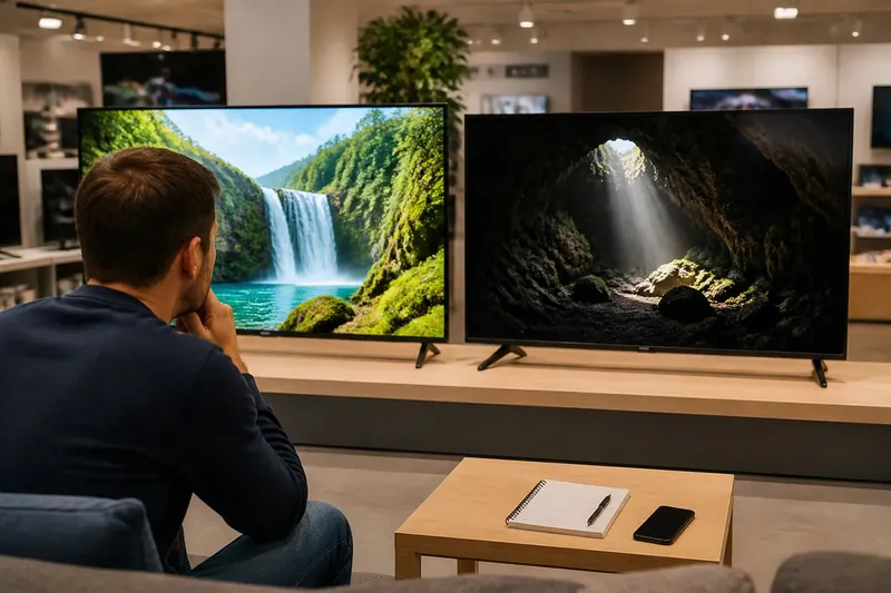
Two televisions glow side by side in an electronics store: one makes a nature clip look vivid, while the other shows more detail in a shadow. A five-minute screen comparison can help you decide which differences matter for the way you watch, rather than letting a flashy demo make the choice for you.
Choose a viewing purpose
Start with the kind of viewing you want the screen to handle. For movies in a dim room, you might care most about seeing faces and clothing in dark scenes. For a display used near the kitchen counter, readable text and a comfortable picture from the side may matter more.
Write one question in your phone, such as “Can I follow this scene from my usual seat?” That gives your comparison a practical focus and makes vague impressions like “better” easier to unpack.
Bring familiar content
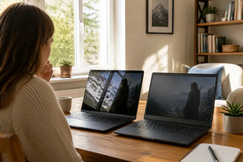
Choose a scene, photo, or page you already know. A familiar face, dark jacket, bright window, and fine detail give you several things to notice without needing a technical test pattern. For computer use, include a page with ordinary text and a photo.
When possible, play the same content from the same source on both screens. If one display is showing a streaming version and the other a locally stored file, the source itself could explain some differences. Treat that viewing as a broad impression rather than a direct comparison.
Set up a fair view
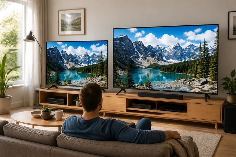
If you can arrange the displays, place them near each other at similar heights. Sit where you normally watch, or use the seat that matters most in your home. At a store, compare from one spot and avoid judging one display head-on and the other from the side.
Keep the room lighting steady. At home, choose your usual lamp or curtain setting before you start. Cue both screens to the same moment and watch the same brief section; exact synchronization is less useful than seeing matching content.
Use ordinary picture modes
For the first look, choose a normal or standard picture mode on each display if one is available. Vivid or demonstration modes can emphasize punchy colors and brightness, which may be less comfortable in an everyday room. If a screen has only a bright default mode, note that rather than assuming its image cannot be adjusted.
Leave advanced controls alone during this pass. Changing contrast, color temperature, motion processing, and noise reduction together makes it hard to tell what shaped your impression. There is no need to make two displays look identical; focus on whether each seems comfortable with settings you would actually use.
Notice the useful differences
Watch the same scene and use this list to connect what you observe with a decision. If a feature does not matter for your viewing, there is no need to keep inspecting it.
- Faces: Check whether skin looks natural to you. If one display makes faces distracting or oddly colored, then prefer the other for face-heavy content; otherwise, move on.
- Shadows: Check whether dark clothing or a dim room still has visible detail. If one screen loses detail you want to see, then favor the other for dark scenes; if neither bothers you, don’t let this decide the purchase.
- Highlights: Check whether a bright cloud or lamp retains texture. If one becomes a blank patch that distracts you, then give the other display the edge for bright scenes; otherwise, record no meaningful difference.
- Motion: Check a moving subject for distracting blur, jerkiness, or an artificial look. If one effect catches your attention, then favor the screen whose motion feels more comfortable; if both look fine, leave motion settings untouched.
- Text and edges: Check whether small writing is comfortable to read and outlines look clean. If one screen makes text tiring or edges harsh, then prefer the other for reading or computer use; if both are comfortable, don’t overvalue a subtle difference.
- Side seating: Check the view from a seat your household actually uses. If color or detail becomes uncomfortable there, then favor the display that remains easier to watch from that seat; if everyone watches from the center, give this less weight.
Compare your usual conditions
After the first look, change one condition that reflects your home viewing. You might move to the side seat or switch on the lamp you normally use. Keep the content and picture modes unchanged so you can tell whether that one adjustment changes your preference.
Say you are choosing a screen for a shared living room. From the center seat, Screen A looks richer, but from the armchair where someone usually watches, faces look dull; Screen B stays comfortable from both spots. In that invented situation, the household might prefer Screen B even though Screen A made the stronger first impression.
Record what matters
Write one or two observations for each display, including the scene and viewing condition. “Dark coat detail was hard to see from the couch” is more useful than a made-up score, especially if dark films are a regular choice.
Skip efforts that cannot improve the decision: there is little value in measuring a difference you cannot see or adjusting controls you would never use. Instead, note whether each display suits your actual content and seating.
Which comparison questions help?
What if the screens cannot share a source?
Use the closest available version of a familiar scene and note that playback may differ. Compare broad impressions, but do not assume every difference comes from the display.
Should I use a test pattern?
A test pattern can help with a specific question, but familiar films, shows, or pages are more representative of ordinary viewing. Use a pattern only if an uncertainty remains after the everyday comparison.
What if one screen looks too dim?
Check whether an energy-saving or store-oriented mode is active. If a setting is familiar and easy to reverse, try one modest adjustment; otherwise, leave it alone and record how the screen looks as configured.
Can I compare screens at home?
Yes. Use the same content, room lighting, and viewing position, and alternate between displays while the scene is fresh in your mind.
Choose for your home
Read your notes as a record of your preferences, not a technical ranking. If one display remains more comfortable with the shows, films, or text you use, that is useful evidence for your choice. If the pictures seem equally suitable, compare practical details such as inputs, controls, placement, and the retailer’s return terms.
A five-minute screen comparison is most helpful when it stays focused: familiar content, a real viewing position, and notes tied to your habits. Before buying, check that the display can connect to the devices you plan to use; that small compatibility check can matter more in daily life than a subtle picture difference.